
Headers and footers
Promo/Info Bar
Slim top bar with rotating announcements, phone, address, social links
A style sets the look. A header, sections and a footer make the page. Blocks hold your content, and moving parts give a visitor something to do. Everything here is a working part of the Think Bright System, not a mockup.
This is not a menu. You do not pick from it. We design around your business, and these are the parts we reach for. Every business and every word shown is sample content, and the businesses are fictional.
Headers, footers and the building blocks underneath, drawn by the engine with sample words.
Slim top bar with rotating announcements, phone, address, social links

The block at the bottom of every page: link columns, contact details, socials, and the copyright line

The block at the bottom of every page: link columns, contact details, socials, and the copyright line

The block at the bottom of every page: link columns, contact details, socials, and the copyright line

The block at the bottom of every page: link columns, contact details, socials, and the copyright line

The block at the bottom of every page: link columns, contact details, socials, and the copyright line

The block at the bottom of every page: link columns, contact details, socials, and the copyright line
The bar at the top of every page: logo, menu, and usually a phone number or a call-to-action button. Sometimes a thin utility strip sits above it with hours or socials
The bar at the top of every page: logo, menu, and usually a phone number or a call-to-action button. Sometimes a thin utility strip sits above it with hours or socials

The bar at the top of every page: logo, menu, and usually a phone number or a call-to-action button. Sometimes a thin utility strip sits above it with hours or socials

The bar at the top of every page: logo, menu, and usually a phone number or a call-to-action button. Sometimes a thin utility strip sits above it with hours or socials

The bar at the top of every page: logo, menu, and usually a phone number or a call-to-action button. Sometimes a thin utility strip sits above it with hours or socials

The bar at the top of every page: logo, menu, and usually a phone number or a call-to-action button. Sometimes a thin utility strip sits above it with hours or socials

The bar at the top of every page: logo, menu, and usually a phone number or a call-to-action button. Sometimes a thin utility strip sits above it with hours or socials

The bar at the top of every page: logo, menu, and usually a phone number or a call-to-action button. Sometimes a thin utility strip sits above it with hours or socials
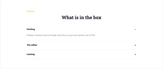
Stacked collapsible rows with a heading and hidden content, not questions and answers
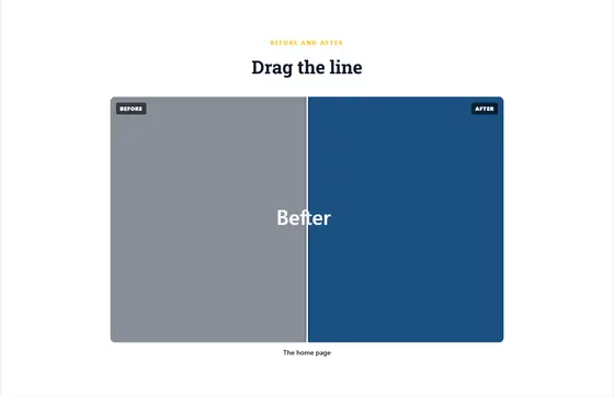
Two images of the same subject compared, sometimes with a slider handle dragged between them
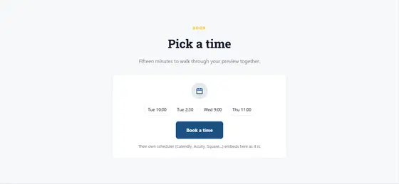
A booking calendar or scheduler (Calendly, Acuity, Square and the like), or a card that links to it
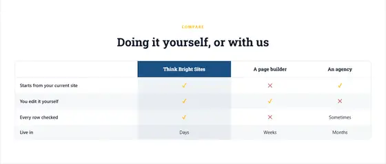
A side-by-side comparison: plans or options in columns with ticks and crosses, or us versus them

How to reach them as separate cards: call, email, visit (the address), opening hours
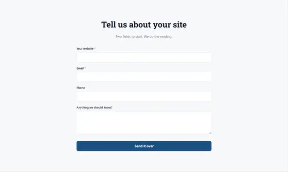
Lead generation or contact form with input fields and submit button
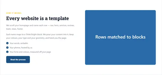
50/50 or 60/40 layout: image on one side, text+CTA on the other

Full-width call-to-action with heading, description, button
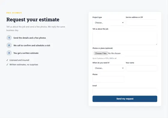
Request a quote or estimate: project type, where, what, photos or plans, when, contact — often beside what happens next
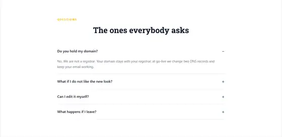
Expandable question-and-answer pairs

One wide photograph across the page with no words on it, used as a divider between rows
Grid or masonry layout of images/photos

An embedded map, usually with a pin on their location

Email signup section with title, description, input field, submit button
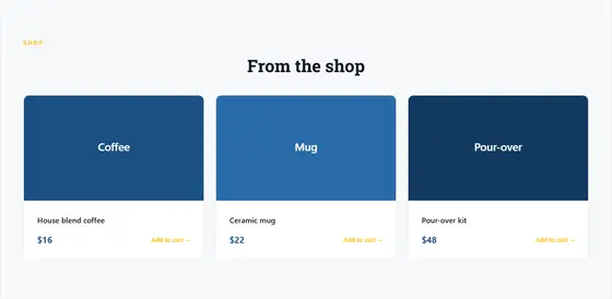
Product cards in a grid with image, title, price, add-to-cart
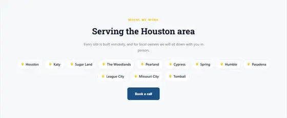
The towns, cities, counties or neighbourhoods they serve, listed or as chips, often with a heading like "Areas we serve"
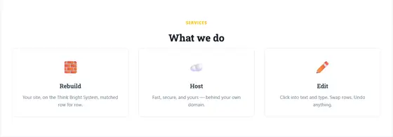
Cards for the services offered, each led by an icon rather than a photograph
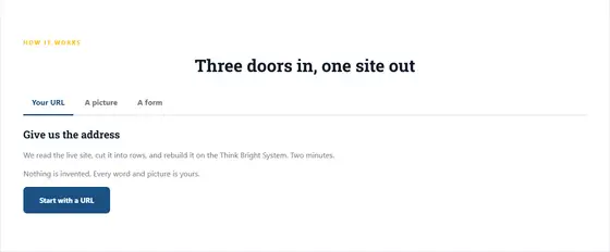
A row of tab labels; choosing one shows its panel of content below
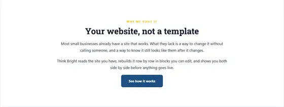
Words with no picture: a heading and one or more paragraphs, sometimes a list or a button. An intro, an about, a mission
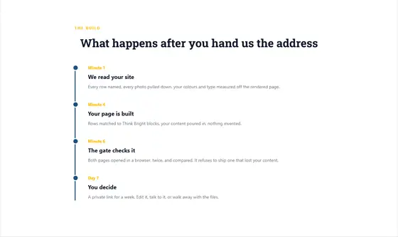
Chronological milestones with year, title, description
The layouts a page is assembled from, each one a working part.

The band in their accent color, heading large.
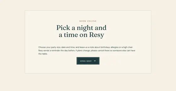
A centered framed card on the ground with the heading and button.
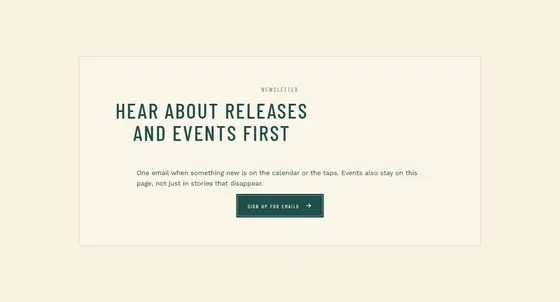
A full-width dark band: heading, three columns, a button.
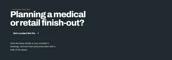
A slim band: one line of words with the button at the right.
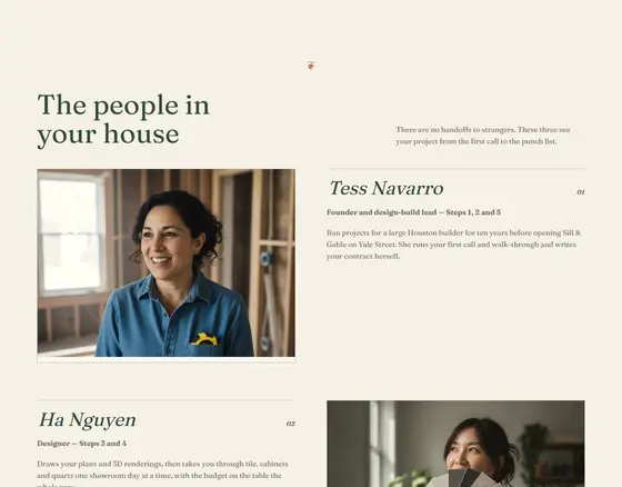
One card per line, photo beside the words, sides alternating.
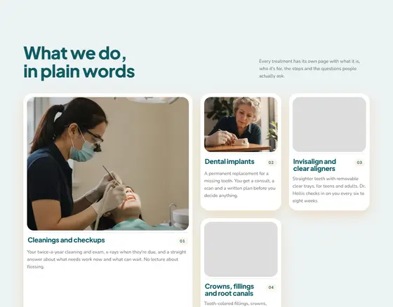
One large card and smaller ones around it in a mixed-size grid.
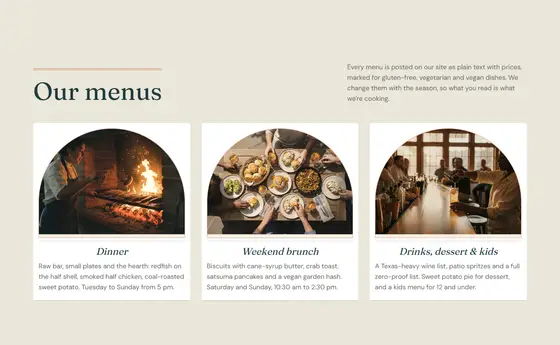
Equal cards with photo, title and words, three across.
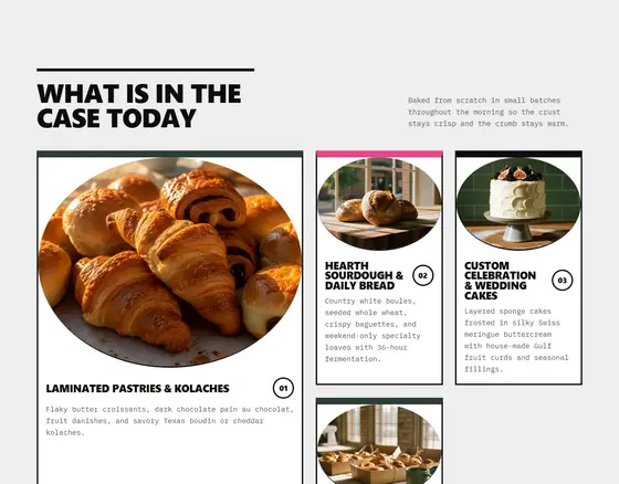
Tall photo tiles three across, captions with numbers.
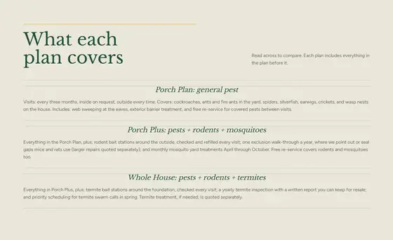
A numbered list with rules, small photo thumbnails, words beside.
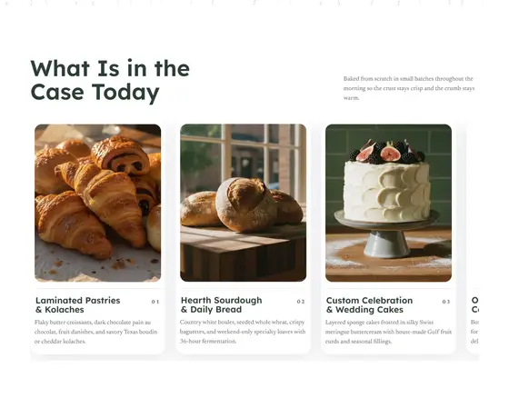
Cards in one row that scrolls sideways, the next one peeking.
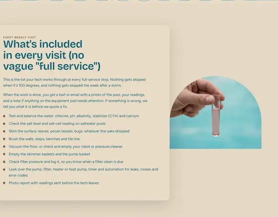
A large photo with the words in a card overlapping its edge.
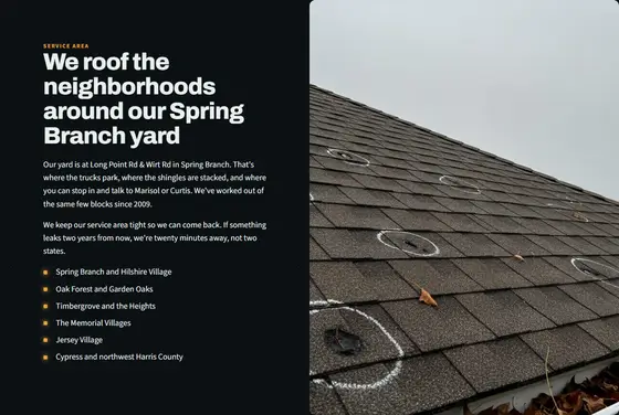
The photo bleeds to the page edge on one half, words on the other.
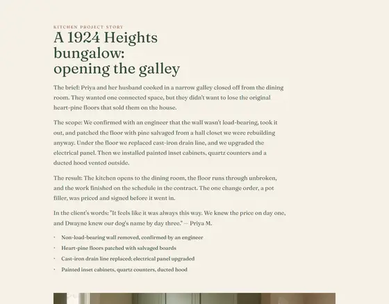
A wide photo, the words beneath in a readable column.
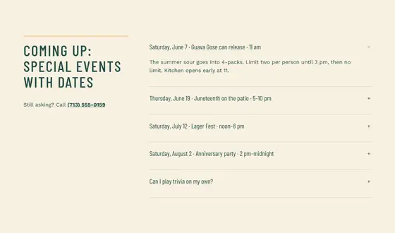
Framed photo beside the words, sides alternating down the page.
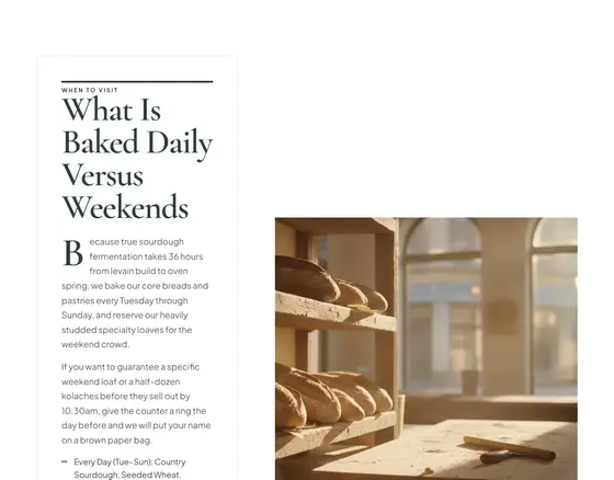
The words inside a framed panel on a tint, the photo small beside.

Square photos in an even grid.
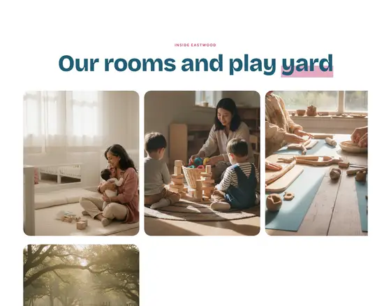
One row of photos scrolling sideways.
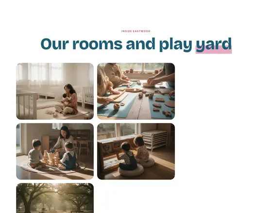
Columns of photos at their own heights.
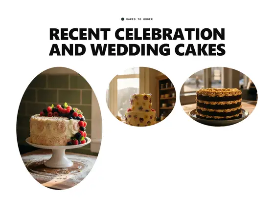
A mixed grid of their photos.
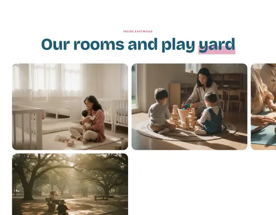
The section pins; scrolling down moves the photos sideways.

Logo at left, the menu beside it, the phone and button at right.
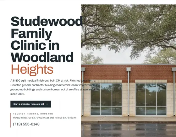
Huge headline overlapping an offset photo; the details in a ruled column.

Centered headline and buttons on the ground, a wide photo band beneath.
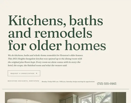
An oversized headline across the page like a magazine cover, the photo below with a caption line.
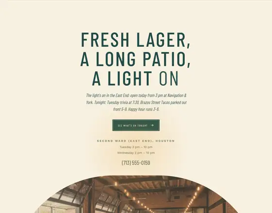
Their photo (or slides) edge to edge, headline bottom-left, details bottom-right.
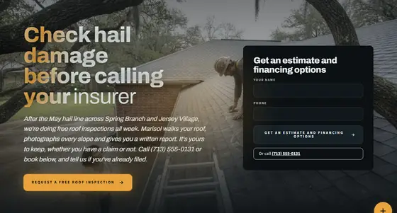
Headline, phone and promise at left over their photo; a short request form card at right.
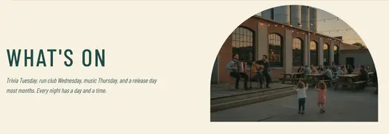
Their photo behind the page title.
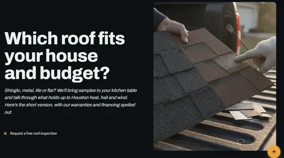
Title and deck at left on the ground, the photo framed at right.
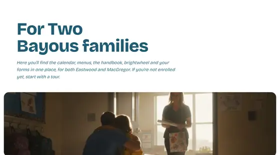
The title on the ground, a short wide photo strip beneath.
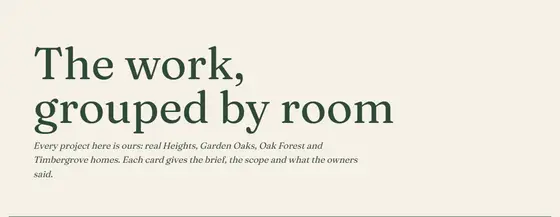
A large title and deck on the ground with a rule; no photo.
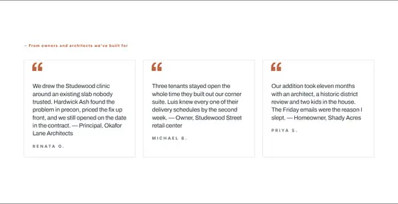
Two or three review cards side by side.
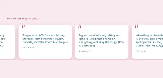
Review cards drifting past in an endless row; hover pauses.
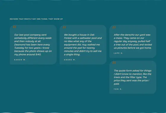
A masonry wall of reviews of different lengths.
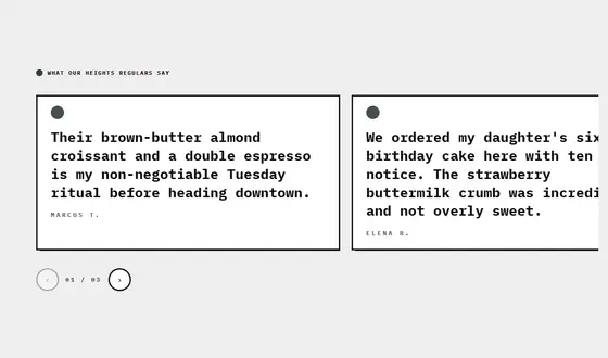
One big quote at a time, the next peeking, arrows and a count.
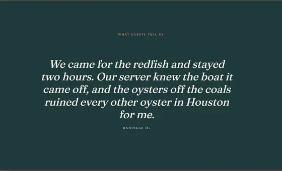
One quote set huge, centered, the name small beneath.
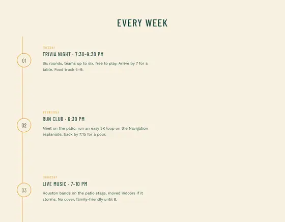
Each step a row: number, photo, words.
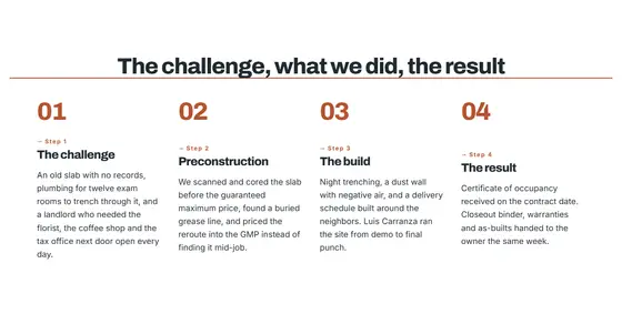
Numbered steps side by side in columns with a connecting rule.
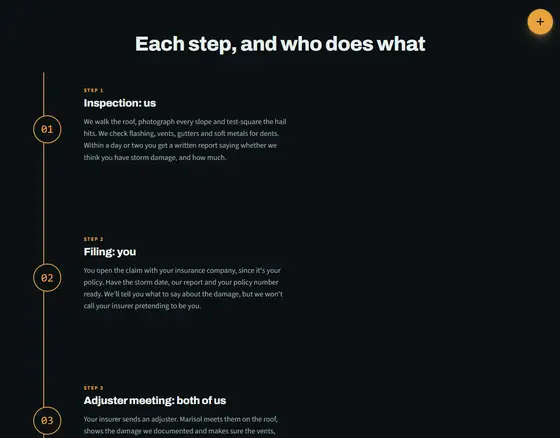
A vertical line with numbered nodes and the words beside.
Design directions with their own type, color, shape and motion rules.
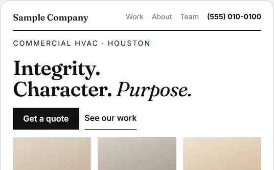
A serif display face, tall photos and hairline rules, like a feature spread.
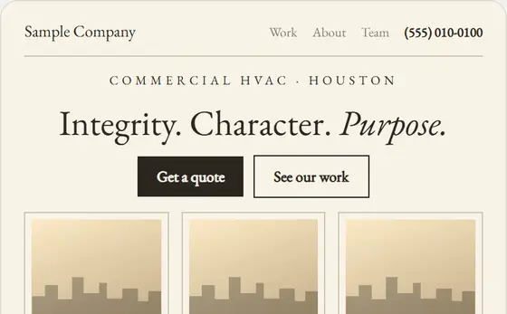
Serif throughout, centered, narrow measure, thin frames, very airy.
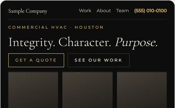
Thin serif, wide-tracked caps, black and ivory, outlined gold buttons.
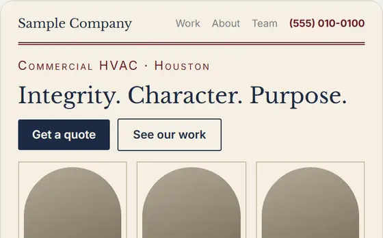
Classic serif, small caps, arched photos and double rules. Established since.
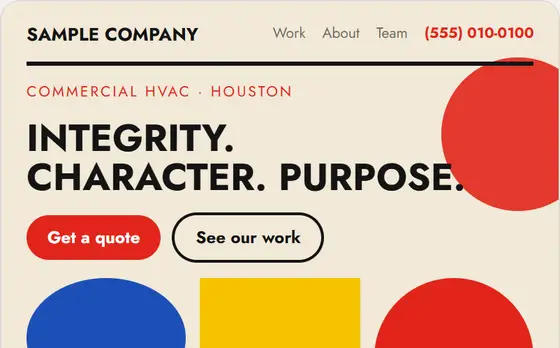
Circles, squares and primaries arranged like a poster.
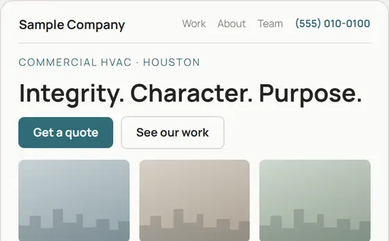
Few elements, lots of air, one accent, big quiet photos.
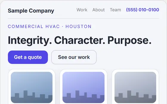
Trustworthy and clean: soft cards, one confident color.
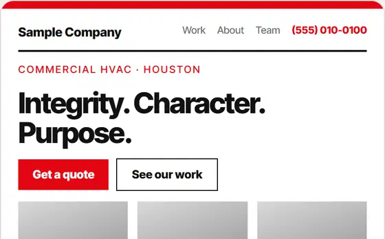
Strict grid, one grotesk, black and white with one red. Information first.
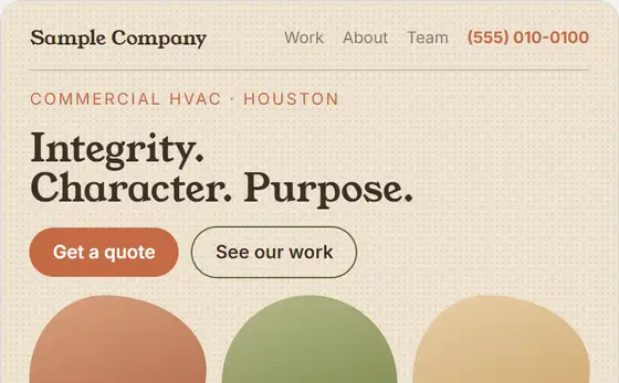
Rounded serif, blob and arch photos, terracotta and olive, a little grain.
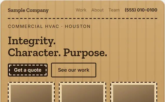
Slab type, kraft and wood tones, stitched and stamped details.
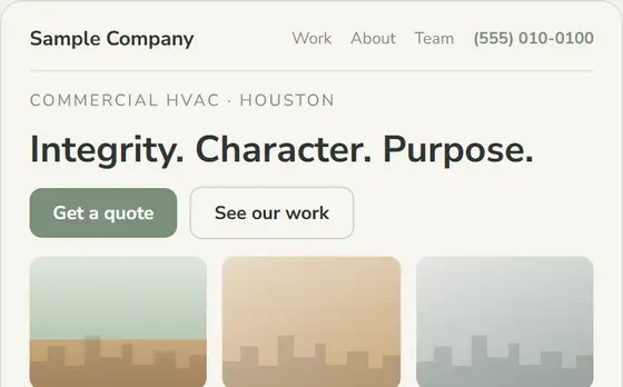
Soft sans, oak and sage, daylight photos, nothing extra.
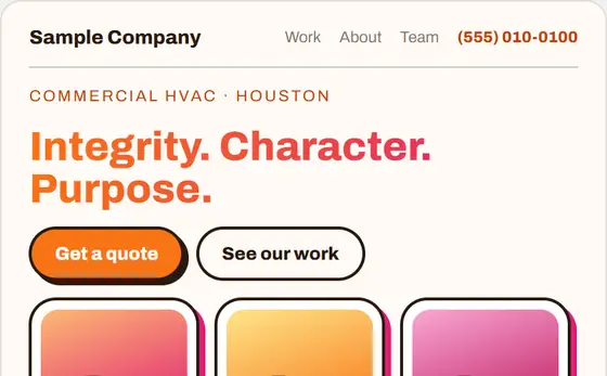
Heavy type, offset shadows, orange into magenta. High energy.
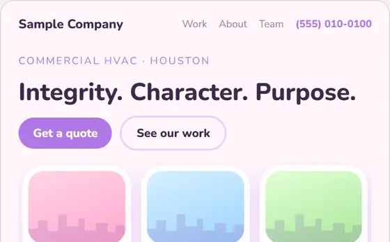
Rounded sans, big radii, soft colored shadows, pastels.
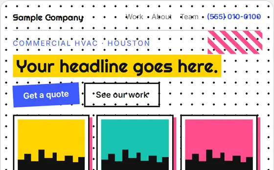
Squiggles, dots, clashing primaries, highlighter headlines, tilted buttons.
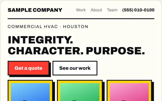
Thick outlines, hard offset shadows, saturated blocks. Data that shouts.
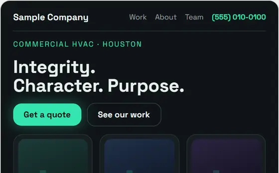
Near-black ground, one glowing mint accent, crisp grotesk.
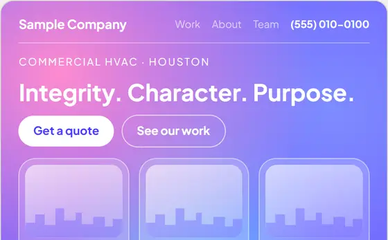
Frosted panels over soft mesh gradients.
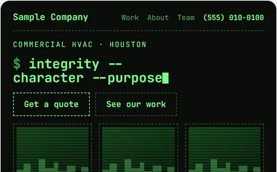
Monospace, dashed borders, green on black, a blinking cursor.
Things a visitor scrolls, presses or watches. Stills here; they move on a real page.
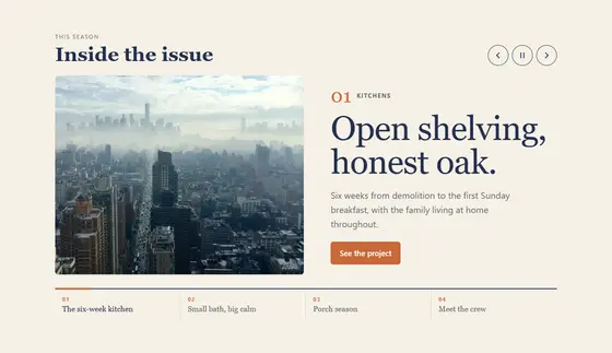
Magazine-style feature slides — photo, kicker, headline, one line — with the cover lines as tabs; it moves on every seven seconds.
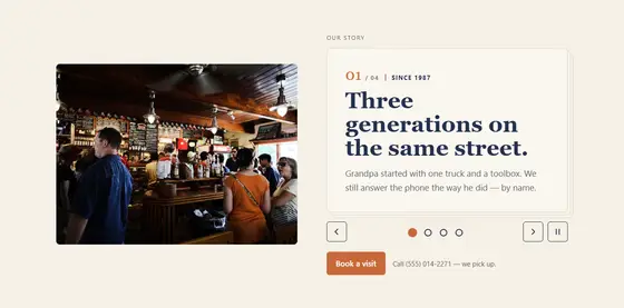
The hero reads as a short book: each page turns over in 3D, by itself or by dots, arrows, swipe and keys.
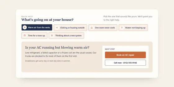
Tap the chip that describes what is going on; its answer opens with a little pop and the right next step (call or book).
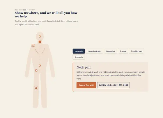
A calm back-view figure with a soft dot on each area they treat; tap a dot (or its name) and their answer for that area opens beside it, with the next step.
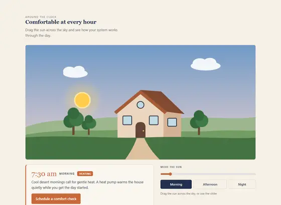
Drag the sun across the sky above a storybook house (or use the slider or a preset); the sky turns from morning to night, the windows glow, and the message for that time swaps in.
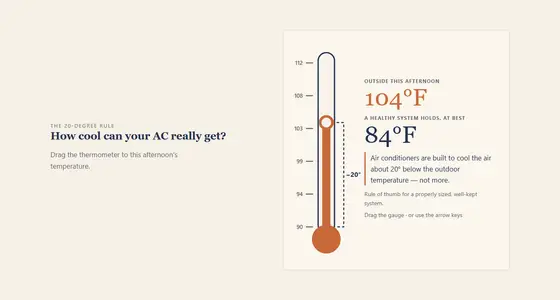
Drag the gauge (or use the arrow keys); the reading, what it means and the message update as it moves.
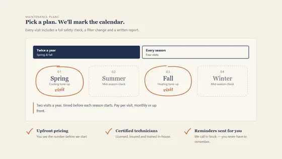
Pick a plan and hand-drawn rings circle the items it includes; ticks draw in beside the promises as the row arrives.
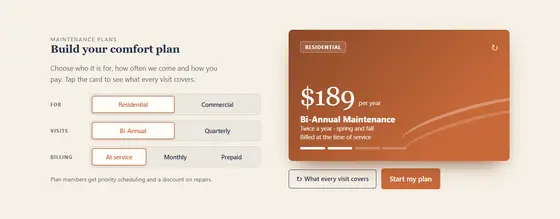
Pick options in a few segmented controls and the plan card updates live; tap the card and it flips over to show what is included.
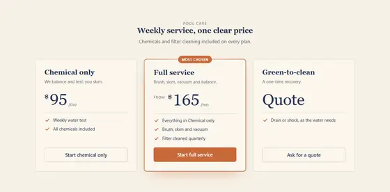
Flip the switch (monthly / yearly, residential / commercial); the thumb springs across and every price rolls to the other set.
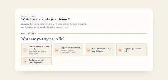
Three to five taps (what are you trying to fix, ducts or not, where the unit could go, what matters most) end on the type of system to ask about, one plain sentence why, and the dealer's booking button and phone. No prices or sizes: the dealer sizes in the home.
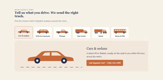
A row of drawn vehicles (car, coupe, SUV, pickup, minivan, van, box truck, semi, motorcycle, RV, bus); pick yours and it drives onto a moving road while their answer opens — which truck they send and the call.

A short statement over a slow, living field of the brand's own colors: soft pools drift and blend under a fine grain. Calm, premium, no clicks needed.
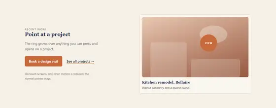
The mouse becomes a small dot with a trailing ring that grows over links and buttons and shows a short word ("View") over marked pictures; touch screens keep their normal behavior.
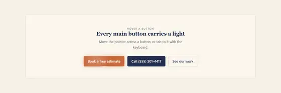
Hover or tab to a main button: a light traces its edge and a soft glow follows the pointer across it.
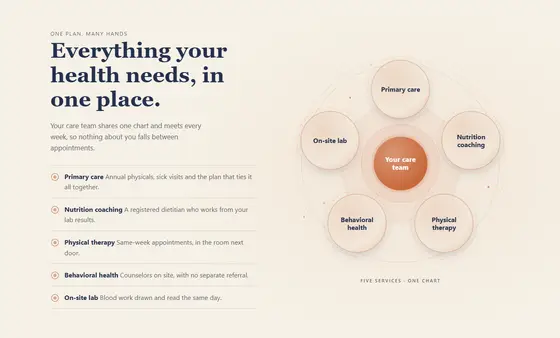
A calm illustration of the row's items as a cluster of breathing nodes, with drifting particles and a slowly turning ring; hovering an item lights its node.
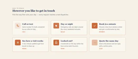
A row of small icon tiles; point at, focus or tap one and its icon morphs into its second state (menu to close, sun to moon, plus to check) beside the tile's title and line.
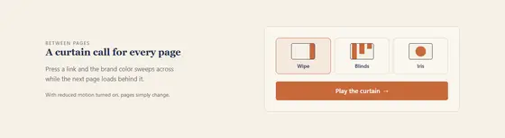
Moving between pages, a curtain in the brand color sweeps across, the next page loads behind it and the curtain lifts.
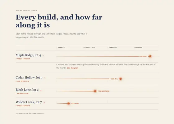
Rows fill to their percentage one after another as they come into view, a glowing dot and label landing at the end; pressing a row opens its detail.
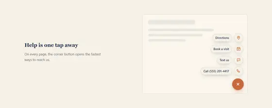
A round button in the corner of every page blooms into call, text, book and directions with a springy stagger.
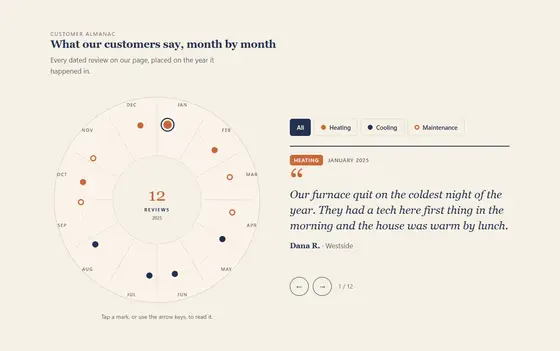
A year dial with every review placed at its month; hover, tap or arrow through the marks to read each quote, and filter by topic.
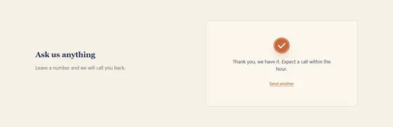
Send a form: the button becomes a spinner that closes into a drawn check, and the thank-you line appears beneath.
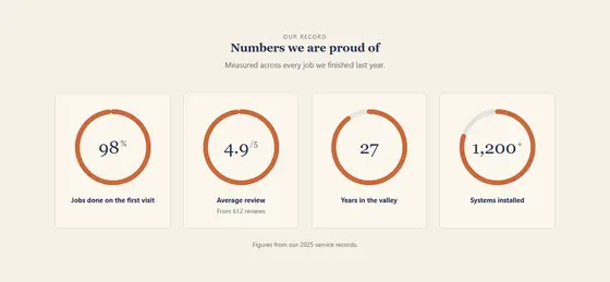
Their figures fill rings (or donuts, pies, dot dials) as the row comes into view, each number counting up in the center.
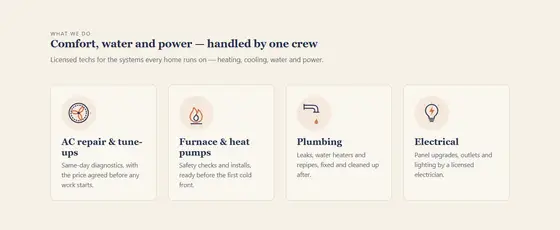
A strip of three or four services, each with a small looping line drawing of the trade (a fan turning, a drip falling, rain on a roof) beside its title and line.
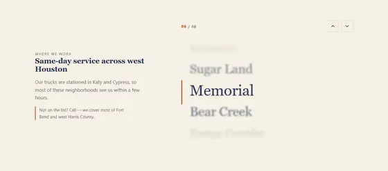
A list of short lines scrolls past a center line; the line in focus is large and sharp while the others blur and fade.
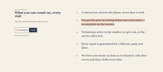
Tap a line and a highlighter sweeps across it; a small chip counts what is marked and clears it.
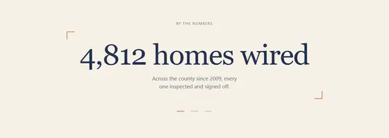
A big short line decodes from shuffling glyphs into its words, then cycles to the next line on a timer or a press.
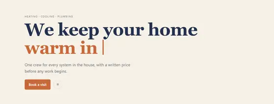
The end of the headline types itself out, pauses, and cycles through two to five phrases with a blinking caret.

Iridescent bubbles drift up behind the headline; the cursor pushes them aside and a click or tap pops one into droplets and a ring.

Snow, rain, leaves or petals fall over the section; a slider (or the time of day) sets how much, and the message changes with it.

Recent reviews, finished jobs and bookings land one by one as a fanned stack of notifications; tap the stack to spread them out.
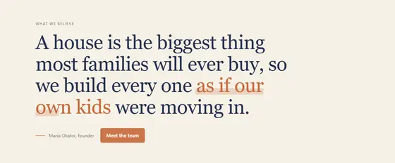
A big statement rises in word by word (or letter by letter) out of a blur on scroll, then one phrase in it is marked.
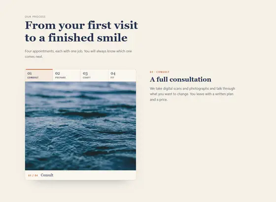
A pinned figure beside the steps changes picture (or fills a vessel) as each step reaches the middle of the screen; tabs mark progress and jump to a step.
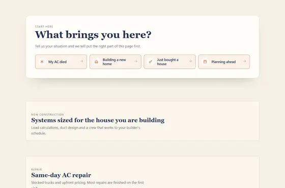
The visitor picks the situation that brought them; the headline speaks to it, the page re-orders so the rows that matter for that situation come first (numbered, with why), the rest dim, and a "Your path · change" pill stays on screen.
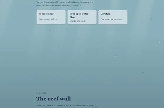
The whole page changes state as the visitor scrolls — down into the deep, from day to night, through the four seasons, from cool to oven-hot or from hot to cool — so the scroll tells what the business does.
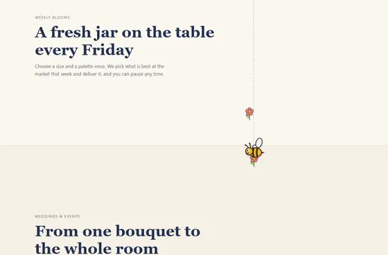
A small character rides the page margin as the visitor scrolls, reacts as each section arrives (a bee visits a flower, a pup hops, a plane loops) and ends beside the call to action, pointing at it.
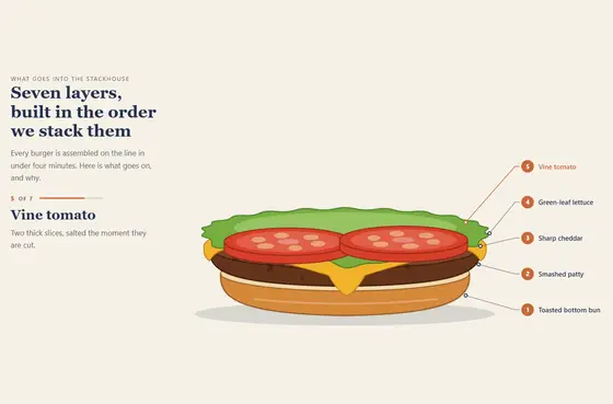
Scrolling builds what the business makes, layer by layer: each layer drops into place on a pinned stage with its numbered label beside it, a counter reads "3 of 6", and the finished object ends with a closing line and a button.
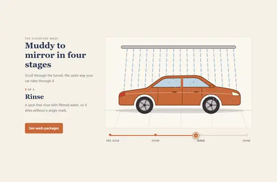
Scrolling turns the before into the after: the same picture moves through each stage of the work, the stage names mark progress along a track with one line per stage, and a handle on the track can be dragged to scrub back and forth.
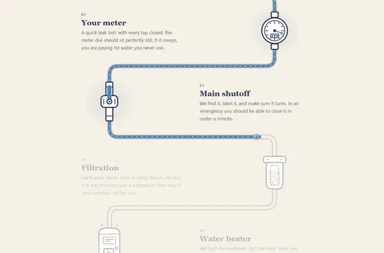
As the visitor scrolls, one line draws through the job — pipe, wire, road or seam — lighting each station of the work on the way and arriving at the finished result and the call to action.
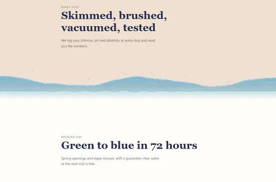
The seams between the page's sections are made of the trade's material, and play once as each section arrives — water swells and settles, suds wipe and pop, a paint roller rolls the next color in, sawdust settles, frost creeps and melts, heat shimmers, steam rises, a broom sweeps, ink bleeds, confetti bursts.
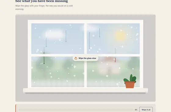
The visitor uncovers the story by hand — wipes fog off a window, scratches a card, peels the old layer, shines a torch through a dark attic, slides an x-ray lens over a wall or brushes soil off roots — and past a threshold it finishes itself, labels what was found and shows their line and button.
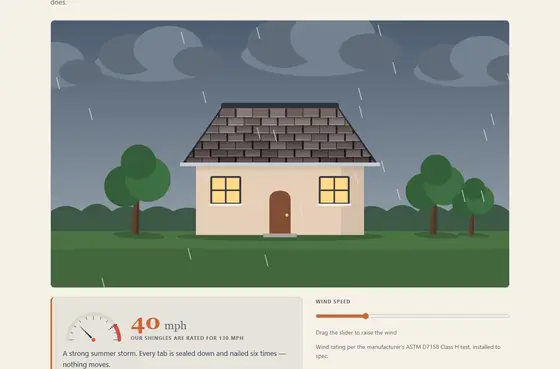
A small cause-and-effect scene the visitor drives — push the wind up and watch the roof hold, deepen the attic insulation and watch the heat stay in and the bill come down, switch their fixtures on in a dark room, or place sprinkler heads and watch the dry lawn turn green — with the business's numbers and line as the result.
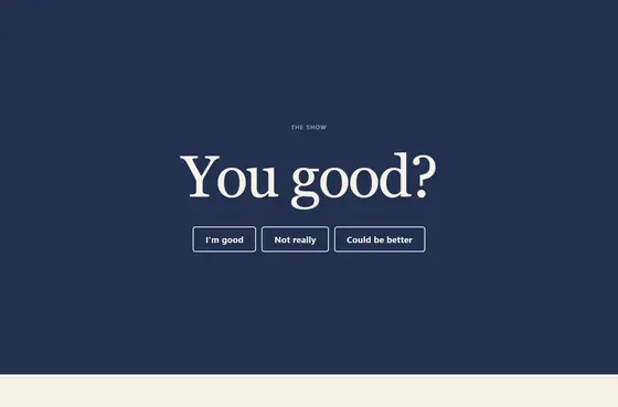
The page opens on the show's own question in display type with three to five honest answers; the visitor taps one, the opener flips to its inverse, the hosts answer back in one line of their own words, and the one conversation that fits plays from its poster. A "You said … · change" pill stays on screen.
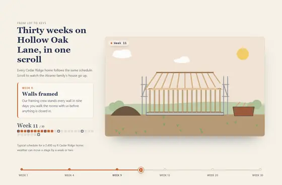
A pinned stage scrubs through weeks or months as the visitor scrolls or drags the timeline: the drawing (or their own progress photos) builds stage by stage while the date, the stage card and a progress calendar keep pace.
Whole sites built on the system, for businesses we made up so we can show everything.
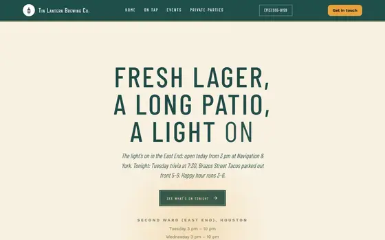
A fictional bar business, built start to finish on the system.

A fictional daycare business, built start to finish on the system.
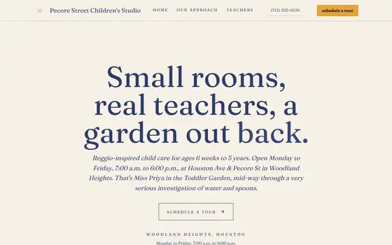
A fictional daycare business, built start to finish on the system.
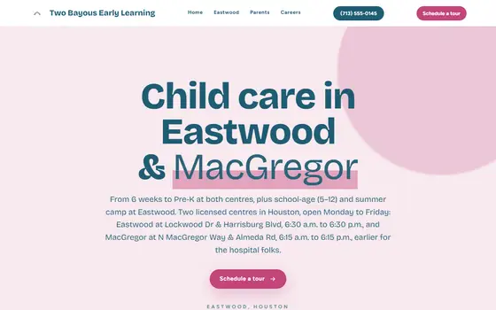
A fictional daycare business, built start to finish on the system.

A fictional dental business, built start to finish on the system.
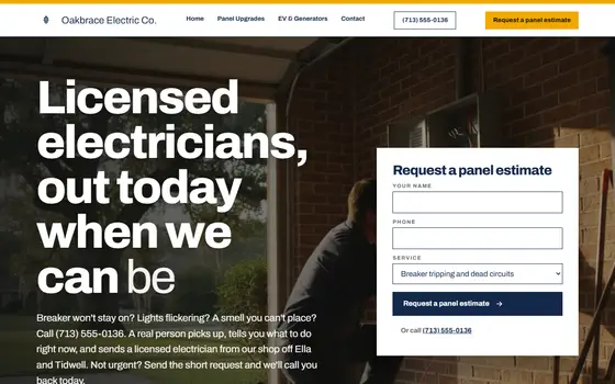
A fictional electrical business, built start to finish on the system.
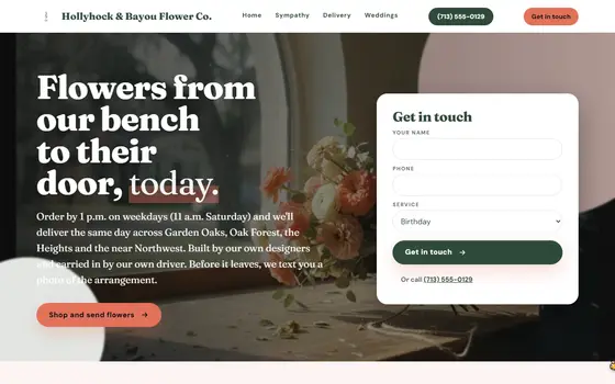
A fictional florist business, built start to finish on the system.
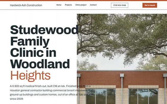
A fictional general contractor business, built start to finish on the system.
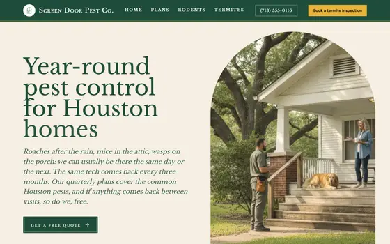
A fictional pest control business, built start to finish on the system.
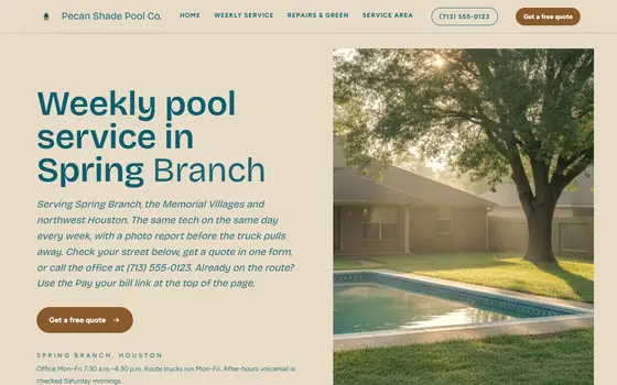
A fictional pool service business, built start to finish on the system.
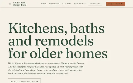
A fictional remodeling business, built start to finish on the system.

A fictional restaurant business, built start to finish on the system.
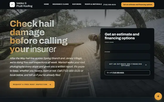
A fictional roofing business, built start to finish on the system.
A sample of pictures generated for the demos. Your own photos always come first.
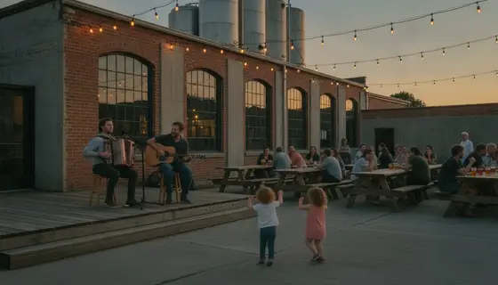
Generated for a fictional demo. Your site uses your own photos first.

Generated for a fictional demo. Your site uses your own photos first.

Generated for a fictional demo. Your site uses your own photos first.
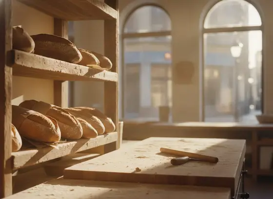
Generated for a fictional demo. Your site uses your own photos first.
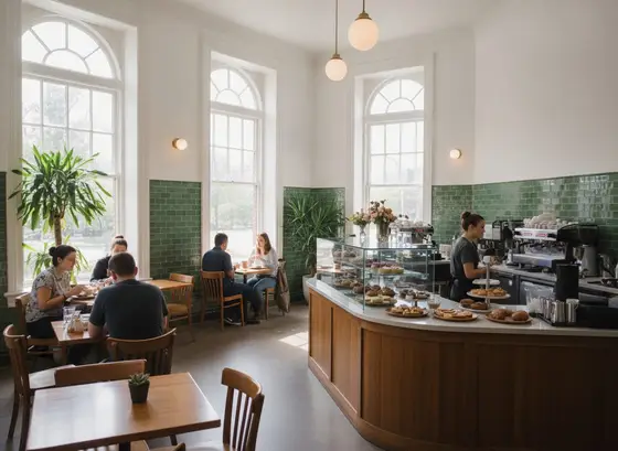
Generated for a fictional demo. Your site uses your own photos first.

Generated for a fictional demo. Your site uses your own photos first.

Generated for a fictional demo. Your site uses your own photos first.

Generated for a fictional demo. Your site uses your own photos first.

Generated for a fictional demo. Your site uses your own photos first.

Generated for a fictional demo. Your site uses your own photos first.

Generated for a fictional demo. Your site uses your own photos first.

Generated for a fictional demo. Your site uses your own photos first.
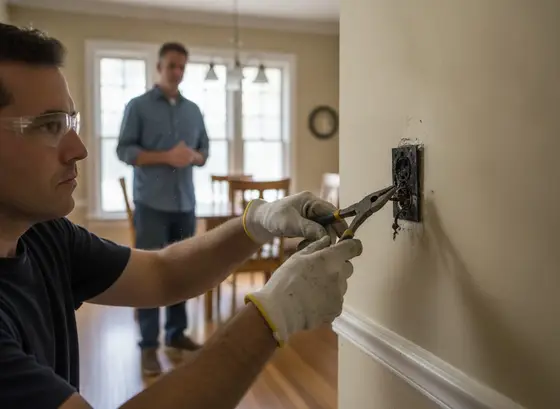
Generated for a fictional demo. Your site uses your own photos first.
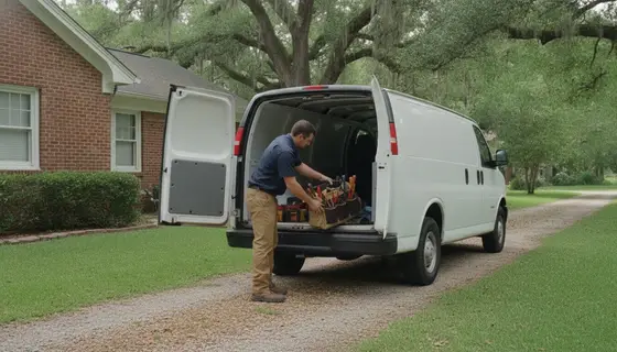
Generated for a fictional demo. Your site uses your own photos first.

Generated for a fictional demo. Your site uses your own photos first.

Generated for a fictional demo. Your site uses your own photos first.

Generated for a fictional demo. Your site uses your own photos first.

Generated for a fictional demo. Your site uses your own photos first.

Generated for a fictional demo. Your site uses your own photos first.
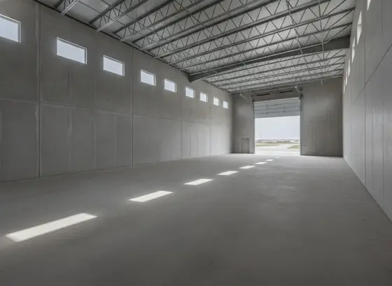
Generated for a fictional demo. Your site uses your own photos first.
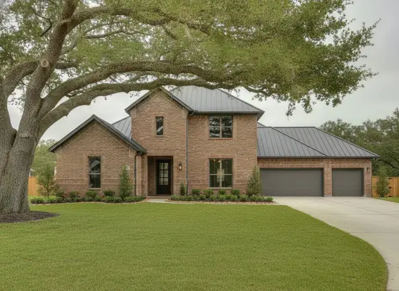
Generated for a fictional demo. Your site uses your own photos first.

Generated for a fictional demo. Your site uses your own photos first.

Generated for a fictional demo. Your site uses your own photos first.
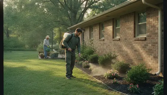
Generated for a fictional demo. Your site uses your own photos first.
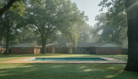
Generated for a fictional demo. Your site uses your own photos first.

Generated for a fictional demo. Your site uses your own photos first.
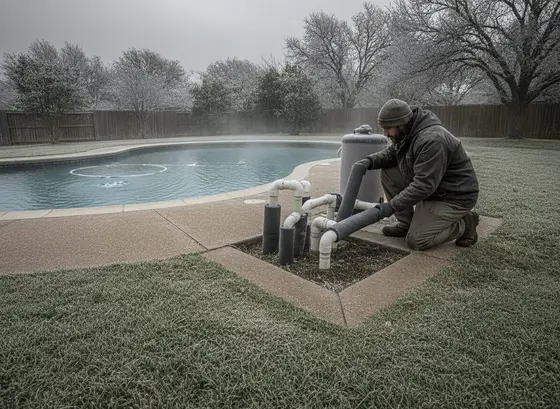
Generated for a fictional demo. Your site uses your own photos first.
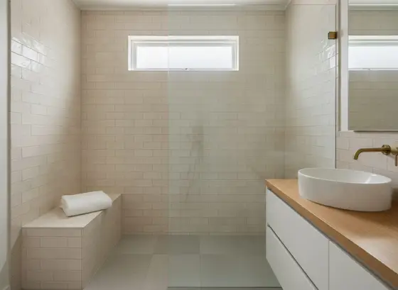
Generated for a fictional demo. Your site uses your own photos first.
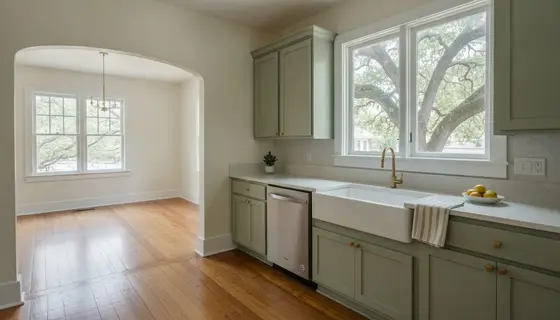
Generated for a fictional demo. Your site uses your own photos first.
Generated for a fictional demo. Your site uses your own photos first.

Generated for a fictional demo. Your site uses your own photos first.

Generated for a fictional demo. Your site uses your own photos first.

Generated for a fictional demo. Your site uses your own photos first.
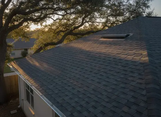
Generated for a fictional demo. Your site uses your own photos first.

Generated for a fictional demo. Your site uses your own photos first.
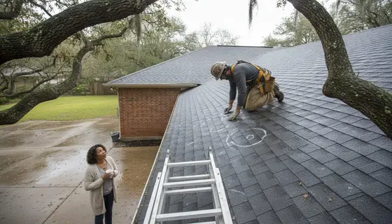
Generated for a fictional demo. Your site uses your own photos first.
Nothing matches that. Try another word.
Start with the free check. In about a minute you get your grade and what to fix first.
Run the free check